| New Kits 2020/2021 23:16 - Jul 17 with 16380 views | Brierls |
C’mon people, where is the new kit thread.
Here’s an article from the BBC with some - https://www.bbc.co.uk/sport/football/53388384
Taking inspiration from Loch Ness FC, do you think we could get images of...no, as you were. |  | | |  |
| New Kits 2020/2021 on 23:19 - Jul 17 with 7545 views | 442Dale |
As TVOS alluded to, this would have been a really good interpretation of our colours next season. We can’t just have a similar looking striped kit again. | 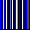 |
| |
| New Kits 2020/2021 on 23:23 - Jul 17 with 7532 views | 442Dale |
Another good Errea design. The red trim in the shirt and socks makes the kit.
The keeper kits are rubbish, mind. | |
| |
| New Kits 2020/2021 on 08:41 - Jul 18 with 7421 views | fitzochris |
|  |
| |
| New Kits 2020/2021 on 09:07 - Jul 18 with 7398 views | boromat |
| New Kits 2020/2021 on 08:41 - Jul 18 by fitzochris |
|
I do like those Motherwell kits! Not sure how the players will like playing in them though. |  |
| |
| New Kits 2020/2021 on 10:33 - Jul 18 with 7320 views | Mass_Debater |
| New Kits 2020/2021 on 09:07 - Jul 18 by boromat |
I do like those Motherwell kits! Not sure how the players will like playing in them though. |
Why? | | | |
| New Kits 2020/2021 on 10:40 - Jul 18 with 7298 views | Nigeriamark |
| New Kits 2020/2021 on 23:23 - Jul 17 by 442Dale |
Another good Errea design. The red trim in the shirt and socks makes the kit.
The keeper kits are rubbish, mind. |
They look like market stall "knock-offs". Terrible |  | | |
| New Kits 2020/2021 on 10:43 - Jul 18 with 7292 views | Shun |
442’s been slacking.
I’d be happy with anything really that still incorporates blue, black and white. There are such a vast number of designs to choose from, knowing we don’t have to limit ourselves to stripes. All of the following are very achievable in our colours.


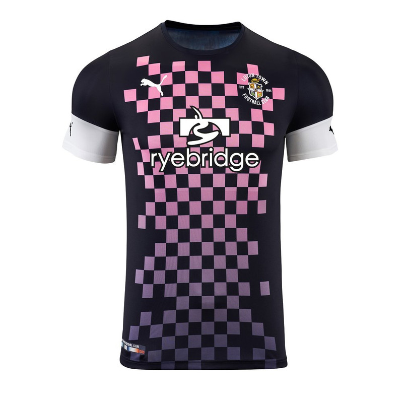 |  | | |
| New Kits 2020/2021 on 10:49 - Jul 18 with 7277 views | Nigeriamark |
Las Vegas lights ( number 15) the worst of that bunch, with Partick's close behind ( number 17)
Loch Ness black kit ( number 3) & Providence city ( number 22) my favourites | | | |
Login to get fewer ads
| New Kits 2020/2021 on 11:20 - Jul 18 with 7247 views | 442Dale |
I’ve not been slacking. The point around utilising our unique colours in different ways was made a lot over the years.
Like a lot of things, got tired of saying it when there’s nobody listening. That’s all.
Anyway, have Barnsley’s efforts. Patience rewarded and all that.
| |
| |
| New Kits 2020/2021 on 13:22 - Jul 18 with 7119 views | Shun |
| New Kits 2020/2021 on 11:20 - Jul 18 by 442Dale |
I’ve not been slacking. The point around utilising our unique colours in different ways was made a lot over the years.
Like a lot of things, got tired of saying it when there’s nobody listening. That’s all.
Anyway, have Barnsley’s efforts. Patience rewarded and all that.
|
It might be the dull sponsor, but that’s one of the most boringly bad kits I’ve ever seen. | | | |
| New Kits 2020/2021 on 16:08 - Jul 18 with 7054 views | Ancoats_Blue |
| New Kits 2020/2021 on 13:22 - Jul 18 by Shun |
It might be the dull sponsor, but that’s one of the most boringly bad kits I’ve ever seen. |
Jeez. That Barnsley kit looks 20+ years out of date. Standard lower league kit.
I really like Inter’s wavy blue/black strip job. Could see our colour scheme working well with the Mottherwell and Dortmund designs too.
Whatever we do with our kits I hope blue and black stays. Much nicer than the old predominantly blue / small bit of white kits we had in the past. |  | | |
| New Kits 2020/2021 on 17:33 - Jul 18 with 6996 views | 442Dale |
| New Kits 2020/2021 on 16:08 - Jul 18 by Ancoats_Blue |
Jeez. That Barnsley kit looks 20+ years out of date. Standard lower league kit.
I really like Inter’s wavy blue/black strip job. Could see our colour scheme working well with the Mottherwell and Dortmund designs too.
Whatever we do with our kits I hope blue and black stays. Much nicer than the old predominantly blue / small bit of white kits we had in the past. |
We’ve now had kits including blue and black for 11 out of the last 12 season. The one year we didn’t (15/16) Errea produced a very bland shirt which wasn’t at all popular and we were told the players helped choose it. Presumably they bought 20 each to make up for it.
No idea at all why fans weren’t able to vote on the home design this season with better choices being available to make use of the colours we use. | |
| |
| New Kits 2020/2021 on 22:07 - Jul 18 with 6874 views | ChaffRAFC |
With the amount of white away kits that get voted for and last seasons grey kit, I'm not convinced fans should be allowed to vote.
Home kit last season was the best of a truly awful bunch but was an exact replica of the previous seasons kit. Awful. There are so many variations of the colours you could do. Norwich's kit with the black and blue colour instead of yellow/green would have been ace. That Lincoln home shirt is another great example of a different design that works.
If we end up with a replica of last season or one of them lazy black/stripe designs where it just changes position on the shirt then I f*****g give up. |  |
| If I hadn't seen such riches, I could live with being poor |
| |
| New Kits 2020/2021 on 11:00 - Jul 19 with 6722 views | boromat |
Just those collars look quite tall and tight. Not sure how breathable that'll make it. It could also be fine of course. | |
| |
| New Kits 2020/2021 on 11:33 - Jul 19 with 6686 views | TVOS1907 |
Another Errea kit for Cheltenham:
|  |
| When I was your age, I used to enjoy the odd game of tennis. Or was it golf? |
| |
| New Kits 2020/2021 on 11:37 - Jul 19 with 6685 views | TVOS1907 |
Kilmarnock kit by Hummel. Could see this working in blue & black with bits of white.
| |
| When I was your age, I used to enjoy the odd game of tennis. Or was it golf? |
| |
| New Kits 2020/2021 on 13:09 - Jul 19 with 6625 views | macro |
| New Kits 2020/2021 on 22:07 - Jul 18 by ChaffRAFC |
With the amount of white away kits that get voted for and last seasons grey kit, I'm not convinced fans should be allowed to vote.
Home kit last season was the best of a truly awful bunch but was an exact replica of the previous seasons kit. Awful. There are so many variations of the colours you could do. Norwich's kit with the black and blue colour instead of yellow/green would have been ace. That Lincoln home shirt is another great example of a different design that works.
If we end up with a replica of last season or one of them lazy black/stripe designs where it just changes position on the shirt then I f*****g give up. |
You know that's what it's going to be |  | | |
| New Kits 2020/2021 on 13:21 - Jul 19 with 6606 views | TVOS1907 |
Cambridge home & away
| |
| When I was your age, I used to enjoy the odd game of tennis. Or was it golf? |
| |
| New Kits 2020/2021 on 13:47 - Jul 19 with 6570 views | Ancoats_Blue |
| New Kits 2020/2021 on 11:33 - Jul 19 by TVOS1907 |
Another Errea kit for Cheltenham:
|
I’d be quite happy if we use that template swapping red/ white for blue/black | | | |
| New Kits 2020/2021 on 15:30 - Jul 19 with 6508 views | 49thseason |
Does anyone know if there is a complete palette of colours to choose from or just the same reds Yellows and blues as in every other year?
I would prefer a much brighter / lighter shade of blue and why do we insist on adding black into the mix? Given a free choice I would prefer a Bugatti blue shirt with a raspberry red pinstripe with the reverse , a raspberry shirt per this season's away kit, with a blue pinstripe as the away kit.
as we seem doomed to play more games under flood lights next season, perhaps in front of very thin crowds, I struggle to imagine why we would choose colours that simply act as camouflage against dark backgrounds. I thought the raspberry kit we used last season was a standout choice. BTW I think we perhaps should play in white shorts and socks at night if we are to continue with the same old royal blue and black colour scheme.
https://www.pantone.com/color-finder/638-C
https://www.pantone.com/color-finder/232-C |  | | |
| New Kits 2020/2021 on 15:33 - Jul 19 with 6505 views | Dale23years |
When do we find out about out new kit. | |
| |
| New Kits 2020/2021 on 15:38 - Jul 19 with 6498 views | boromat |
| New Kits 2020/2021 on 15:30 - Jul 19 by 49thseason |
Does anyone know if there is a complete palette of colours to choose from or just the same reds Yellows and blues as in every other year?
I would prefer a much brighter / lighter shade of blue and why do we insist on adding black into the mix? Given a free choice I would prefer a Bugatti blue shirt with a raspberry red pinstripe with the reverse , a raspberry shirt per this season's away kit, with a blue pinstripe as the away kit.
as we seem doomed to play more games under flood lights next season, perhaps in front of very thin crowds, I struggle to imagine why we would choose colours that simply act as camouflage against dark backgrounds. I thought the raspberry kit we used last season was a standout choice. BTW I think we perhaps should play in white shorts and socks at night if we are to continue with the same old royal blue and black colour scheme.
https://www.pantone.com/color-finder/638-C
https://www.pantone.com/color-finder/232-C |
I don't see an issue with our blue white and black home colour scheme. It's reasonably unique and it's good to have an identity we just need to do something a bit creative with them. I like thick black and blue stripes but it's time for a change. Maybe blue with white pinstripes and black trim/shorts/socks. Or more emphasis on all three colours being incorporated into the shirt. | |
| |
| New Kits 2020/2021 on 17:09 - Jul 19 with 6451 views | TVOS1907 |
| New Kits 2020/2021 on 15:38 - Jul 19 by boromat |
I don't see an issue with our blue white and black home colour scheme. It's reasonably unique and it's good to have an identity we just need to do something a bit creative with them. I like thick black and blue stripes but it's time for a change. Maybe blue with white pinstripes and black trim/shorts/socks. Or more emphasis on all three colours being incorporated into the shirt. |
Good post.
I always said we should have gone back to blue and white after the Centenary Season, but the powers that be decided to meld together all the colours we'd worn since formation.
I've now come round to thinking that blue, black and white works for us and is associated with us - but it has never been said that we have to combine those colours into stripes.
There is so much scope and so many different designs and formats that we could go for, as long as the unique colours were used.
Having something that looks different every season would also increase sales in the shop as those who buy shirts for themselves or their children are more likely to purchase something that looks different to the previous year.
It's not just about what the team look like; it's also about how it contributes to the club's finances. | |
| When I was your age, I used to enjoy the odd game of tennis. Or was it golf? |
| |
| New Kits 2020/2021 on 17:23 - Jul 19 with 6432 views | 442Dale |
| New Kits 2020/2021 on 17:09 - Jul 19 by TVOS1907 |
Good post.
I always said we should have gone back to blue and white after the Centenary Season, but the powers that be decided to meld together all the colours we'd worn since formation.
I've now come round to thinking that blue, black and white works for us and is associated with us - but it has never been said that we have to combine those colours into stripes.
There is so much scope and so many different designs and formats that we could go for, as long as the unique colours were used.
Having something that looks different every season would also increase sales in the shop as those who buy shirts for themselves or their children are more likely to purchase something that looks different to the previous year.
It's not just about what the team look like; it's also about how it contributes to the club's finances. |
That last post is exactly why supporters wish the club would look at routes to improve the choices we make on kits. Let it be said, we get it right at times, but not often enough as consideration isn’t always given to specific details which would definitely impact sales.
The last two home shirts being the perfect example of this. | |
| |
| |

