New kit gets the thumbs up Wednesday, 1st Apr 2009 16:24 Amidst all the moans and groans about performances, transfer policy and ticket prices it seems the club have actually done something the fans aprove of today - next season's home shirt has been well received.
The launch of the new home strip for next season happened, somewhat out of the blue, at lunch time today. A full gallery of images of the new shirt, expertly modelled by lee Cook as always, can be seen on the club’s official website at this link. LoftforWords immediately went to regular columnist and resident ‘kit geek’ Ashleigh Rose for his opinion on the new shirt.
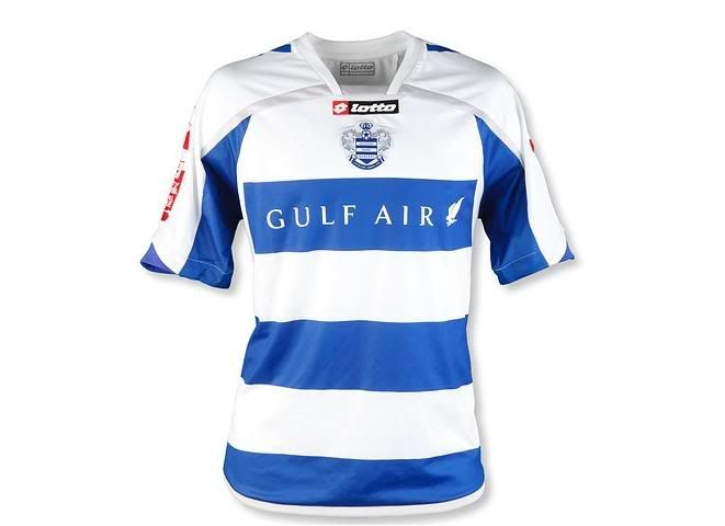
Well that came out the blue didn’t it? There I was coming into the office late due to an inconveniently timed dentist appointment thinking it was just another normal day. Then I clicked on to the QPR website to see the brand new home strip for next season. No build up, no warning this was set to be unveiled just Rowan Vine and Lee Cook standing there in what the R’s will be wearing for home games next season.
To say I was excited would be an understatement. Regulars on the message board are already aware of what kit geek I am so to see Rangers’ new kit so early is a real treat for me. Having already been quite overwhelmed with most of the kits I’ve seen so far for next season (the less said about England’s PE kit and Russia’s zip-up collar the better), I have to say that first impressions on the new strip are generally positive. The most obvious and pleasing thing to say before even looking at the shirt, is that the white shorts are back – thank you! Whoever’s bright idea it was to change the colour this year to blue has obviously for once listened to the fans and it means we won’t be playing in a strip that looks more like Reading next season and we are back to the more traditional R’s white shorts. Good start.
On to the shirt and the obvious thing that stands out that going from a home jersey that was predominately blue, Lotto have gone to the other extreme by making the new shirt more white. This is highlighted by having the shoulders and first hoop all white, which reminds me of the 1990’s influence kits, or the ‘Roy Wegerle’ kit as I refer to it. Although it is broken up by a line of Flavio’s fave colour silver on it, which gives it a nice sleek finish to the upper torso - yes I’m using kit speak now folks! The collar is a simple but stylish design which I like and I’m liking the sponsor a lot more on this kit than the last. It looks better positioned and without the naff gold coloured bird – keeping to the white theme of the kit. The much debated badge looks better than I’ve ever seen on this shirt and for the first time since the Le Coq Sportif 2001 shirt moves to the middle alongside the Lotto logo. I also like the blue touches on the end of the sleeves and shoulder blades so the shirt doesn’t feel too white like the millennium kit we had.
Without seeing the back yet, the only complaint I have, and its only a small one, is that the first blue hoop doesn’t seen to go all the way round due to some v-shaped white mesh under the sleeves. Maybe that’s me being pedantic. I think what we are really seeing and why it’s been released so early is Lotto’s real design for QPR. This season’s effort was a rushed project due to the timing of the deal with the Italian sportswear company. This is why we had such a templated away and third kit this year too. Having now had a year to think about the new shirt, I think they’ve come up with a really nice smart kit that I can’t wait to purchase and see the lads wear against Plymouth at the final home game of this season. If the Dennis the Menace kit also returns then I think everyone will be pleased with Lotto’s results. Let’s hope results on the pitch next season follow suit.
Fans have been quick to comment on the Message Board. Here is a selection of their thoughts, feel free to add your own to the thread or using the commenting facility below.
It looks quite nice, if a bit on the white side what with the shorts also changing to white too. But it was a bit like seeing this season's kit which was very blue and is probably just a matter of getting used to it over a period of time. I really liked this year's home shirt. I don't like it when club's change the kit every year though and I really hate it when the kit is unveiled and used in the season before it's actually supposed to be for... it's all marketing for making money over the summer months I suppose when income is lower, but it still just takes away something about being excited to see the new kit in the summer and then the team and new signings in them on the first day of the season or in the pre-season friendly games. -NeilSI
Have to say the whole kit looks really classy and hats off to Lotto and maybe even QPR!! Haven't bought a kit in years but will be getting this one. Can see the Loft End (all with cupped hands over eyes) packed out with fans in these shirts come August. -Dixie
I like it. Looks a bit like the KLM 80's/90's kit. -WindsorHoop
The Gulf logo looks much better. -zranger
I'm going to go as far as saying it's one of the best kits we've had in the past 10 years! I shall definitely be getting one. -lankylancaster
In shops 25th April!!!! Result as i can buy it before i go away in the summer. You Rrrrrrr'sss -dougal_RBLOCK
Er, isn't the current kit new for this season? Will we have a new home kit every season?! A thousand and one ways to fleece QPR fans! Quite like it though -charlie
Can't believe they have released it already. I like it . Think it looks quite smart. Would prefer the socks to be all white though. -RBLOCK_RANGER
My God...it looks the have the club actually done something that most of us approve of!!! -1MoreBrightonR
Glad the white shorts are back, glad they are not mucking about with the hoops. That's all that matters.-gobbles
Just don't like it when they shove the badge and lotto sign in the middle. Keep em where they should be. Otherwise okay. -Mighty Vine
Glad the white shorts are back but would prefer blue across the shoulder. If tucked in, there'll only be two blue hoops showing and I think a blue shoulder would help with this. -Juzzie
According to the offish, the players had a say in the design. Now it’s sorted out, please can they focus on winning three points every week rather than what they wear on the pitch. Yeah the kit is OK, wont be buying one, never do. Would rather have the points in the bag than a fancy dan kit.
Yours,
Miserable Bleeder
Henley on Thames
-Drewster
Should always start with a blue strip at the top imo. But, they have obviously thought about making the badge and logos work. Am I the only one who prefers blue shorts? -KerryE
Hoops on the back, that's alright then! I preferred the blue shorts as well. -The Chef
It does look a bit bare at the top, but I 'think' I like it. Need to see the quality of the material - this year's was pure gash. -BklynRanger
Me like. -Metallica Hoop
Photo: Action Images via Reuters
